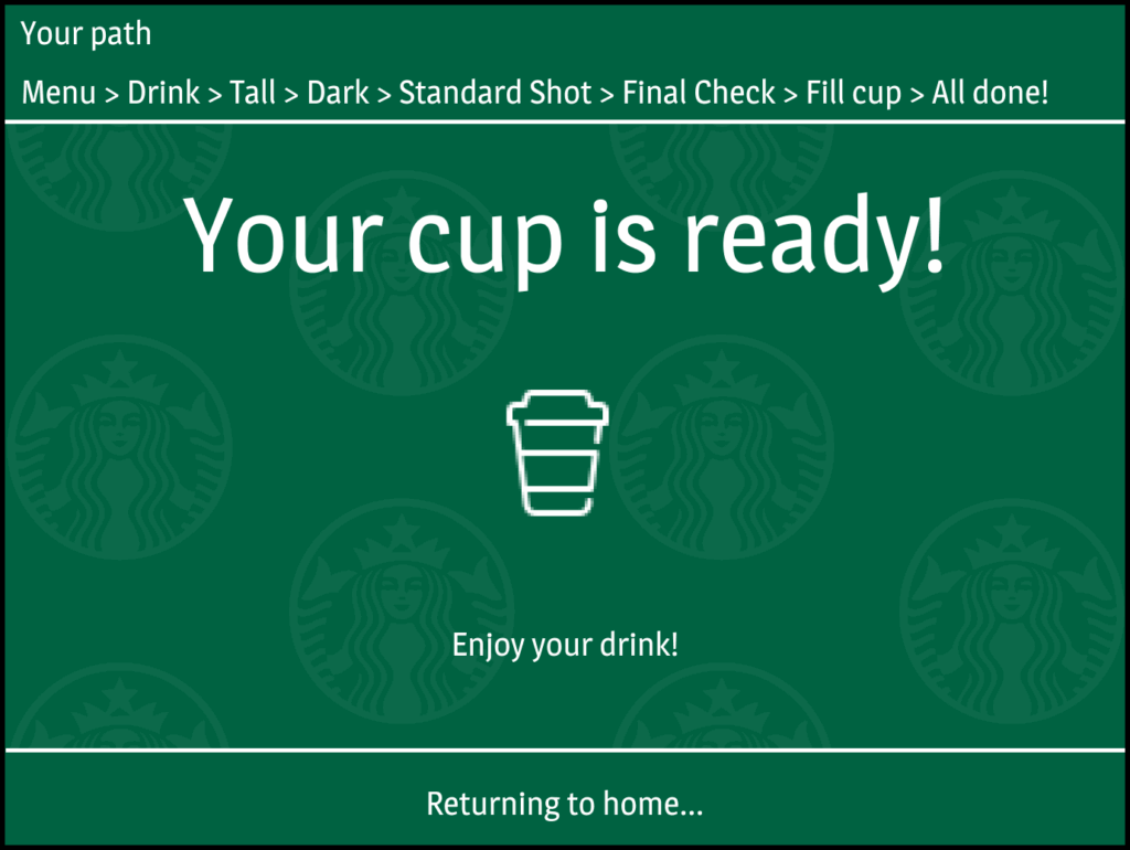
This project involved redesigning the user interface for a Starbucks coffee machine. The goal was to improve clarity and ease of use while making the design feel more visually connected to the Starbucks brand.
Background
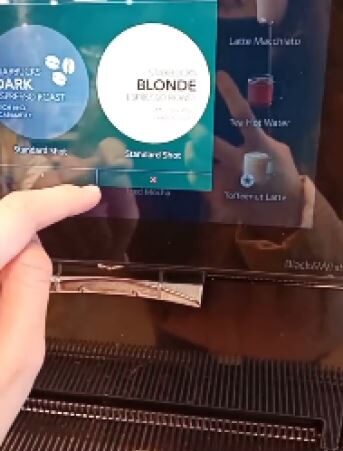
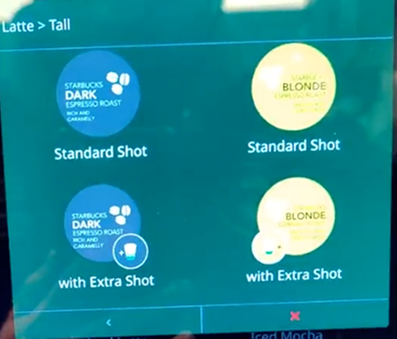
This redesign focused on Starbucks coffee machines. The original UI was functional but bland, with little brand identity beyond a green background. The goal was to enhance visual appeal while preserving core functionality and improving usability.
Challenge
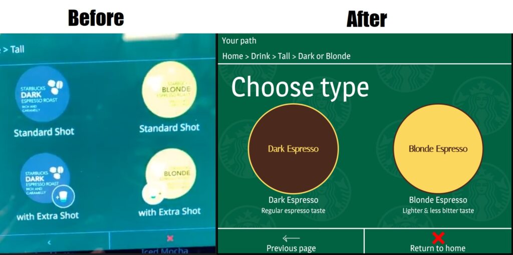
One challenge was the UI’s weak brand presence—users couldn’t easily tell it was a Starbucks machine. Another was icon clarity; as someone new to coffee machines, many icons felt unintuitive. The lack of descriptive labels assumed user familiarity, which hurt accessibility
Solution
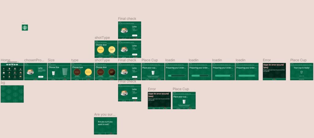
To strengthen branding, I added a faint diagonal Starbucks logo pattern to the background. To improve clarity, I separated beverage options from the green background with a darker overlay. I also introduced a new screen that appears on selection, providing drink descriptions for new or curious users.
Role and Contribution
I handled both the research and design side of the project. I looked at how the existing UI worked, what didn’t feel intuitive, and what was missing from a brand perspective. From there, I redesigned each screen to be more readable and approachable, especially for users who might not be familiar with coffee machine terminology or Starbucks drinks in general.
Results
The redesign made the interface easier to use and more aligned with Starbucks’ brand. Options are clearer, especially for users unfamiliar with coffee terms. The added visual personality made the UI feel more welcoming without compromising functionality